Tuesday 29 September 2015

Crime thriller genre research

The genre of thriller is one which has sustained it's large popularity and success throughout many decades. However, it has evolved very much and film makers continue to challenge conventions in order to create something unique to an audience, whilst following some to create a thrill. The 'thrill' of these genres is (in my opinion) the definitive aspect of these films- if the audience is thrilled, the film is a success. This gives film-makers a lot of leeway when creating a thriller as they can approach the film from many angles, so long as a thrill is achieved.


Crime thrillers on the other hand are slightly more specific, and require a few more conventions to be followed. When I think 'crime thriller', I normally expect to see guns, a chase, some violence etc... This is what I find is important when basing a film on a genre- you have to comply to what the audience expect to see, otherwise they may feel disappointed and the film may gain bad reception.

In my upcoming analysis' of short films I will focus on the genre of crime thriller, and aim to identify the key conventions featured in these texts.

Saturday 26 September 2015

Art/film style of Drive

Drive is one of my all time favourite films due to it's simple yet unique art style. This is apparent in camera work, editing, sound, and mis-en-scene. The film is a slow paced thriller with action elements throughout. However due to it's slow pace, the film is arguably more thrilling. Occasional scenes of violence or deep emotion seem far more meaningful and impacting in comparison to other thrillers I have seen.
Unfortunately this continuous slow pace was unappreciated on release due to regenrefication- the film was marketed as a non-stop film based around a driver and his car.


Friday 25 September 2015

Survey design

In order to grasp a better understanding of what audiences wanted from a short film, I will 100 people some questions which will later aid the planning of my short film. I will use www.surveymonkey.com as well as physical survey sheets in order to acquire the results.
Here are the questions on each survey?

How old are you?

  • 0-14
  • 15-17
  • 18-21
  • 22-29
  • 30-39
  • 40-49
  • 50-59
  • 60+
What gender are you?

  • Male
  • Female
  • Other
How many films (on average) do you watch a month?

  • 0-2
  • 3-5
  • 6-10
  • 11-19
  • 20+
Out of these genres, which two do you most like to watch?

  • Thriller
  • Romance
  • Action
  • Fantasy
  • Western
  • Horror
  • Comedy
  • Sci-fi
  • Drama
Where would you look to find a short film if you wanted to watch one?

  • Youtube
  • Vimeo
  • Television
  • Cinema
  • Other (please specify)
In a crime-thriller, what do you most look for in a narrative?

  • Deep emotion
  • Fast-paced action
  • Strong violence
  • Comedy
Which conventions of the ones listed would you expect to see in a crime film?

  • Guns
  • Drugs
  • Gang bosses
  • Gang rivalry
  • Death
  • Other ( please specify)
Which age reading would you most expect a thriller to be?

  • U
  • PG
  • 12/12A
  • 15
  • 18
Would you be disappointed if a thriller you watched did not meet the criteria of a generic crime-thriller?

  • Yes
  • No
  • Maybe (please specify)

Wednesday 23 September 2015

Poster research summary

From the various thriller posters I have looked at I have a clear understand of conventions that I will use on my poster:


  • Image of characters
  • Bold title
  • Character names
  • Contrasting colours of black&white and one other colour
  • Some sort of violence
I have expanded explanations of the effects of each of these conventions in my previous blog on poster analyses'.
I also have a greater understanding of how to arrange these conventions on my poster, and will look back onto this research when planning and making my poster.

Tuesday 22 September 2015

Short film research

Throughout this post I plan to focus on all conventions that I need to analyse, however I may not write about each convention in each post. From this, I hope to gain a better understanding of the conventions in short films and crime thrillers, and in effect be able to begin to plan my short film.

Boy

The text I studied this time was a short film titled ‘Boy’- a drama which focus’ on gender identity. I plan to review how the film-maker aims to create a message and the effects behind that. One thing I have learned from watching short films is that they often focus on one character and one messages. There is no exception for this short film. The lead character is a girl struggling with gender identity, this enables the film-makers to present their view on the subject as well as raise awareness of people struggling with gender identity problems.


Raising awareness of a problem such as sexual orientation or a mental disorder is very common in short films and often effective in educating the audience. I believe this is due to the fact hat short films are a lot easier to make than feature length films (due to the low production cost), as well as them being able to keep a viewer interested for the full length of the short film due to the short run-time. This also enables the film-maker to solely represent a subject, making the text more direct.

One issue that prevents some film-makers from wanting to produce short films is that they are unlikely to be recognized by the general public. Film production companies such as ‘Universal’ only focus on producing feature length films as they are often much more popular- gaining recognition and more money. In effect, makers of short-films are often unable to express their views, and even if a short film does get popular, it is reached mostly by people interested in filmography.
The short film continues to assert the general message, after the protagonists struggle with expressing her personal identity in front of her family, that once people actual listen to her problems they begin to understand. This moral is a widespread message from the film-makers, insinuating that people need to be more open minded and understanding of people who are ‘different'.
This is a topic I could feature in my films, however I do not see how it could fit into the genre of 'crime thriller'. I feel that if I am going to try to create any message in my short film, it should relate to gang crime/drug use.


Bleak

Bleak is a crime thriller short film in which I plan to analyse the filming convententions, i.e. use of camera, editing, sound, and spacing in frame. This short film is not too dissimilar from British crime thrillers such as Layer Cake and Snatch which is why it peaked my interest.


I was initially very impressed by the overall scope of this film. Multiple locations are used creating a theme of constant movement, furthering this, good costume design and relevant locations ensure the film has great realism and believability. I plan on using a total of three scenes set in three locations for my film, I may use wide and long shots to express the scope of these locations. Props and costumes are also elements of this film that I liked; the guns and suits are very generic conventions of a crime thriller. Moreover, the reactions to the gun were serious and mature, unlike some portrayals in thrillers where guns are just used casually. This is typical of British crime thrillers, especially ones by Snatch director Guy Ritchie.

The contrast between gritty crime into comedy is, in my opinion, not executed too well. I blame this mostly on the lack of suspense during sequences, although this does add to some comedic element. Unfortunately, the run-time of this film is 30 minutes, so I cannot use the pacing in this as a reference for my own short film. The lack of dialogue gives the characters a lack of personality and development- something I plan to avoid when scripting my own film.

The font used in the opening titles is similar to that of Drive- hot pink handwriting on a primarily black and white background. The music during this scene is techno, also similar to Drive. This type of pastiche is too blatantly copied in my opinion, if I were to do something similar, I would add my own input by slightly altering them. The scripting is also very literal, something which I will try to avoid by getting help from teachers as I am not an adept writer.

My overall favourite part of this film are the variation of shots set with the black and white colour scheme. This mis-en-scene is similar to that of film noir pieces the the mis 20th century- a movement I have already analysed in previous blogs.


In Game

In game is an A2 action short film which relies heavily on good usage of visual effects. The protagonist progresses through multiple stages of small indie games for iOS and eventually into gameplay similar to triple A titles as a character in those games.


The ever changing plot and locations of this film deeply immerse the audience, however faults in visual effects and sub-par film-making limit this immersion. The film is ambitious- setting the short film out away from other I have viewed, and despite faulty visual work, it is till impressive. My main criticism with this film is the lack of plot, it is almost like a sketch-show, the audience is bombarded with constant gaming references which, despite being fairly meaningless, are executed well. Furthering this, the film does not move fluidly, scenes are cut together in such a way that we, the audience, are left with no direction of what will happen next and what is really going on.

I feel that this film could be adapted and improved by featuring maybe less references, or cycling through them in some logical order, rather than just mashing them all together. Even by incorporating a theme such as the Super Mario plot- a hero trying to defeat a villain to save a girl, but at the end it is revealed that she is actually in another area. I feel that this combination of gaming reference and a plot from a classic game would benefit the film greatly. Instead, the film focus' too heavily on trying to impress and excite the audience, and in doing so neglects story, resulting in a somewhat meaningless film. Despite this, I still think In Game is fun and enjoy the inception-like game cyclical plot.


Real Gone

Real Gone is currently one of my favourite short films and one which I believe will influence my project a lot, despite not being a crime-thriller.


Real Gone is a very clean and simplistic looking short-film with a very easy-to-follow narrative. I believe this narrative is achieved by running the same theme throughout the whole film, a man trying to seek peace in death but failing comically multiple times. The use of comedic timing throughout is contrasted with the controversial theme of death/suicide, which only amplifies the humour more.

The opening sequence to this film features a man being resuscitated on a beach. The establishing shot of the beach features soft colours and the peaceful sound of calm waves- connoting peace. Throughout the film cut-in-shots of this beach are used as a symbol to denote the lead characters want for this peace. This subtle use of symbolism is very effective in a short film as film-makers must be concise with their writing and directing due tot the short run-time. A further benefit of this use of symbolism is the artistic value, straight dialogue can often take away from a scene when used unnecessarily.


Proximity

Proximity is a short film in which suspense is the main factor, it follows one character in a situation where he has to fight for survival against others.
This fear of death throughout the short film isn used to fuel the non-stop tension and enable the audience to fear and sympathies for the protagonist.


Close-up shots of the protagonist are used throughout, including an establishing shot which features the lead with a bag around his head. These close-up shots are used to establish and emphasise the protagonists lack of knowledge of the location and people. The audience can therefore experience everything in the first person as he does.

Shakey-cam and quick cuts are used during tense scenes to lower the visibility and increase the pace of sequences, establishing a greater thrill. Towards the end at the re-equalibrium, the length of shots is extended to express peace and create a tone of relief.

Symbolism is heavily used in the mis-en-scene of this short film, the bad guys wearing black (evil) and the good guys wearing white (good). I plan to use colour and costume designs in order to signify my characters morals and values in the protagonists eyes. This film has very limited colours, emphasising the repetitiveness and routine manor of the plot, the only primary colours are on the tags which are green (safety) and red (danger). I have considered using these signifiers in various shots through my film to reflect the protagonists situation.


Narco

The short film Narco is a British crime-thriller directed by Connor Barbor, a former student Chalfonts Community College, for his A2 coursework. It place in multiple locations within Buckinghashire, and follows two protagonists.


The lighting in this film is exceptionally good, and my favourite aspect of Narco closely followed by the writing. This professional use of high-key-lighting greatly enhances the visuals in each scene. In my film however, I plan to use low-key-lighting in multiple shots in order to add meaning to characters and plot- I find that meaning through visuals and actions is often deeper than meaning through straight dialogue. In saying this, I plan to continue adapting my script throughout drafts in order to make the characters seem more immersive, and develop them as well as drive the plot. One problem I had with Narco was the excesive use of strong language. Although I feel this works in some films, I would argue that it is mostly unnecessary in Narco, but I still respect it's use to create more thrilling and gritty interactions between characters. Costume design furthers this character creation and works effectively; costumes used are similar to those in crime-thrillers.

My overall favourite part of the plot in this film is the start and end. The film begins mid-way through  job the lead protagonists are already pursuing, this is very effective for a short film, as it enables for there to be action without having to rush a full complex story. Narco also follows the structure of equilibrium into disruption, and finally into a stage of re-equilibrium- ensuring the audience is satisfied.

I believe this film would be graded as a bbfc 15 film due to it's use of violence and swearing throughout. This is roughly the age rating I am aiming for, therefore a lot of the content has been able to inspire my planning.


Poster artwork research

In this post I will analyses some famous posters from various film titles in the crime thriller genre, both from feature films and short films. I aim to achieve a better understanding of how these posters differ between the two genres and the reasons ad effects behind that.

First I will analyse 5 posters from feature films:

Layer cake


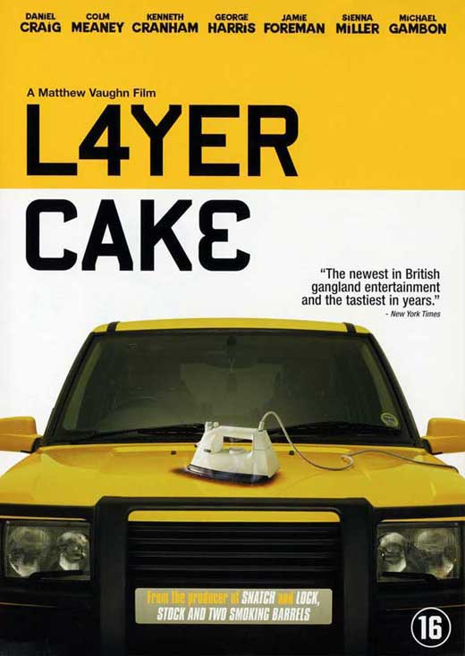
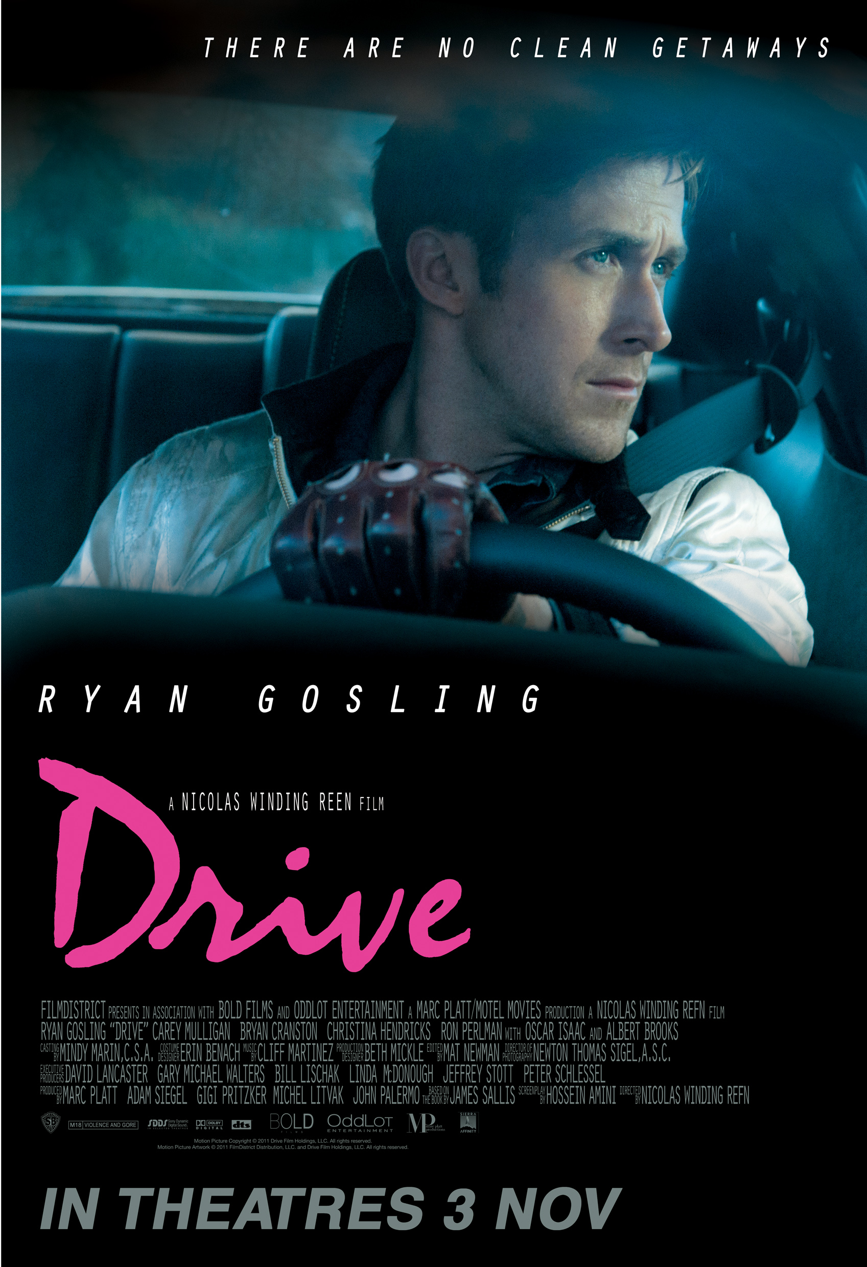
The first thing I notice when looking at this poster is the colour scheme; black and white with a big splash of yellow. The black and white connotes a serious and dark tone for the movie, but the bright primary colour suggests their is also a thrill in the title. The simplicity and lack of detail gives the film a cool and clean theme. The actual props used for the poster are fairly obscure, the iron seems completely irrelevant from what a crime thriller should include, whereas cars are signature features in crime thrillers. The rest of poster is fairly plain and tidy, colours are bold and clean. The title however, is off-center, drawing attention to that part of the film poster. Most features on this posters are ones which I would expect to see: the title, main cast, age rating and a quote are all features I wish to include in my poster. One aspect of this poster that I did not expect, is that it does not say a lot about plot or themes, nor does it include images of the lead characters cast. The image of the car suggests that the film is a driving based film, and the title does not give much info into the plot. This style of marketing can work as the audience are keen to find out more and may look for a trailer or extra information online. However, this could be classed as 'regenrefication' similar to how drive was marketed as a driving film, but was instead more of a slow-paced art thriller/romance.


Snatch


Much like the poster for 'Layer cake'. snatch uses a mostly black and white colour scheme for this poster, with splashes of colour used on important objects. Unlike 'Layer cake', this poster includes the lead characters centered on the poster, yet it does not include the actors names in bold. Each method of displaying characters seem effective in their own way. Similarly though, the title is in black bold text on a lighter colour. From viewing many film posters I can understand that this is a frequent feature in film posters- the title is often bold in a colour that contrasts to the one behind it. By placing the main characters/well-known actors in the foreground the audience is able to familiarize with the actors and from that, gain a better understanding of the films themes and genre. For instance, Jason Statham is well known for his role in crime thrillers, and having Brad Pitt centered in the poster may influence viewers to heighten their expectations for the film. The medium shot featuring the whole of each characters outfits highlights the mis-en-scene of their costumes. The bright colours and oversized smart clothes signify the clumsiness of each character despite their intelligence. Each character is also staring straight into the camera, this exaggerates their intimidating nature. All of this use of mis-en-scene reinforces the genre of crime-thriller due to the exciting look of the characters, but the smart casual clothing of some characters suggests this film is also comedic, which it is.


Hot Fuzz


Featuring two policemen in the foreground of a film poster immediately denotes that the film is one of the buddy-cop genre. This implies the film will include violence and continuous thrills, as well as possibly some comedy. Furthering this, the colours have been edited to be very warm and chrome-like, with an explosion in the background. This gives an effect of a bright, sharp, and fast film immediately establishing it as a crime-thriller. Moreover, the props featured are signature props of a crime-thriller: guns, sunglasses and police uniforms. A heavy use of black and white are used in this poster again, and the title boldly layered over a bright colour is generic of this genre. The mushroom cloud in the background signifies the film is explosive and interesting, moreover the two men walking away from the explosion are therefore signified as dangerous and fearless. As a result of how generic and cliche this poster is, an element of humor is also established due to it's arguable overuse of key conventions. Furthermore, the tag line is another key convention featured in many film posters, especially generic 80's and 90's ones.

Lethal weapon


Lethal Weapon is an 80's action movie, one that shaped the genre of buddy-cop movies which fit into the crime thriller genre. Similar to the previous posters, the colour scheme is black and white with some colour. However, the title in this poster is a light colour onto a dark one. AS these two colours of red and grey contrast- the same effect is still achieved. Much like 'Hot Fuzz', this poster features the two lead cops who the film is based around. Another convention seen before, is the use of the main actors dominating the frtame, much like Brad Pitt in 'Snatch', Mel Gibson takes up almost half of the poster. Furthering this, a gun is used to establish the crime-thriller tone as it is a signature prop. The gun's featured in most of these films are handguns as they are/were very common for gangsters and cops due to their light weight and ability to be concealed easily. If I am to use a gun in my short film it will be a handgun. One-liners are a common theme in action films such as Lethal Weapon, on this poster the tag line is almost a series of one liners in itself. The repetition of short sentences enables this effect. Much like the other posters each character is staring straight into the camera signifying their intimidating nature.


Now I will visit some short film posters that have each inspired my own plans for a poster in some way:


Real Gone


This is the poster of a short film titled 'Real Gone'. Although not a crime thriller, this poster features conventions of short film posters which I may include in my own. The simplicity of the mis-en-scene corresponds to the simplicity of the short film itself. As short films a re far shorter than feature length films they tend to not carry a deep and complex plot, instead they often aim to produce something simple yet meaningful.The title however is something that does relate to the previous posters, although it does not contrast too much, is it big and bold; dominating the poster. The main contrast in colour features a single man and the ground he is standing on. This reinforces the theme of simplicity included in short films, only one character is often developed heavily. Furthering this, the simplicity of the plot enable the designer to create a poster that establishes the main theme(s) far easier than for a feature film, as they're less complex.


Logan

Logan is a film featuring a young werewolf in an interrogation room. It is primarily a horror film, however I believe the poster and cinematography of the film can be used to inspire my planning and plot- dark colours of black, white, and red are heavily present throughout. 


The white-on-black title stands out amongst the background. These are colours which I am likely to use, as I plan on having a darker background due to the dark themes I plan to have for my short film. However, this poster is dissimilar of the majority of crime-thriller posters. Despite this, I think it will still work as my film is planned to be a hybrid genre of both crime and horror thriller- being that I want horror conventions in a  film which features visuals and a plot similar to crime-thriller.

The image of the beat-up man on the chair has also given me some ideas for what to incorporate in my short film, as well as reinforced my idea of having the lead character entered on the poster. The colours used also reflect what is featured in the film, almost every shot consists of black, white, red, and beige- the red being the only primary colour as it is used for blood, a common theme of horror titles. The lack of text in this poster highlights the main image and title- the poster is not crowded. The poster therefore establishes the plot and themes behind the film through mise-en-scene.

One other convention I picked up on whilst viewing this poster is the lack of the character's face being in shot. This is a convention also used in the short film 'Real Gone'. I believe this is used primarily in short films as the lead character is often one which is used to drive the plot and express a meaning represented by the director, but the character themselves is not important, they are just a vessel for an idea. This is not apparent in all short films, but I believe it is effectively used in this. Moreover, the placement and shadow of the man give far more detail to the man than his face would.


Control

This poster is for a film titled 'Control' directed by Anton Corbijn. The pink text on a black background is similar that of Drive, and the black and white image is similar to the poster for Scarface. From these two possible influence alone connotations are already being made. Another possible reference of the cigarette in the mouth refers to The Good, The Bad, And The Ugly, although this is an image featured in many films.


I greatly appreciate the artwork of this poster and feel I may use the roughly the same colour scheme. Furthermore, the image of a protagonist centred in frame is also a convention I plan on using. Black and white has connotations of good and evil, the use of them being split 50/50 further connotes a link between the colours i.e. good vs evil- a common theme in thrillers. 

The Landing


Friday 11 September 2015

History of short film

Short film has been practiced in many forms since the beginning of cinema in the early 1900's. Short films would often be implemented before a feature length film as a sort of teaser. Due to technology not being as advanced as it has now become, short films producers would often require a profit for their short films, limited their potential. Notoriously, silent comedy series' which consisted of 5-10 minute episodes were shown regularly at screenings along with news reals.

However, since then short film has been developed to the point where short films in the 30's were independent and often existed purely as entertainment or propaganda during the second world war. This format encouraged the use of short film for proposing ideas and, in later decades, short film became the main source of advertisement. Although we can clearly distinguish short films from television adverts now, when adverts first emerged they were initially seen as promotional short films.

In the 50's short film also returned to the subject for creating entertainment-based series'. Animating companies such as the Walt Disney company produced many shorts in the mid-1900s.

In the past decade short film has increased in popularity dramatically due to software and hardware being more accessible to the general public. Furthering this, platforms such as YouTube and Vimeo allow for peoples content to be widely shared across the internet.

Tuesday 8 September 2015

Managing explicit content

Films in the UK have to adhere to be classified by bbfc in order to be published and distributed to the public, cinemas, tv etc... Bbfc then categories these films into 6 different age ratings. This means viewers are only suitable to watch/purchase a film if they are above the age the film is labelled with. These age ratings are based of the content featured in the film, here are the age ratings and the reasons a film would be classed with them:

Suitable for all ages

Language

At U there will be avery strict regulations on the use of bad language. Only mild words such as 'damn' may be used infrequently.

Violence

Violence must be very mild and kept to a minimum. Any threat or deep emotion created through violence muse be quickly resolved. Moments of danger and fear must be balanced with reassurance and comical aspects.

Sexuality

The use of sexual behaviour is limited at kissing and cuddling in a  U. Very mild references to sex may be made, but they are unlikely to be approved.

Drugs

Drugs and drug abuse within a U rated film must be regulated and backed up with educational anti-drug messages. Mild references to drugs that children will not understand may sometimes be passed.


U-rated films must not encourage the involvement in any of these themes. If featured, these themes must be discouraged.

Suitable for ages 12 and above


Although films tickets can only be purchased by people 12 and above, if accompanied by an adult an under 12 can view a 12A film.

Language
Films may use strong language depending on the context. Featuring very few uses of strong language in a non-aggressive context is often reviewed and passed by the board.

Violence
A moderate use of violence is allowed but it must lack in detail. Emphasis on blood and injuries is not permitted unless it is justified and not distressing.

Sexuality
Similarly to U rated content, 12 rated films cannot feature sexual content, only low-key intimacy and limited suggestive content that must be approved by the bbfc.

Drugs
Slight features of drugs are acceptable within a 12 rated film so long as they do not glamorise or encourage the use of drugs.

Suitable for ages 15 and above

Language
Frequent use of strong language is permitted in a 15 rated film.

Violence
Strong violence is allowed but the focus must not be too heavily inflicted on the pain or suffering. Visual gore must also be limited.

Sexuality
Sexual nudity can be featured in 15 rated titles, but sex scenes must be kept tame. Sexual-violence is also not permitted but verbal violence can be featured.

Drugs
Drug use may be shown frequently but it cannot be encouraged.

Suitable for ages 18 and above

Language
There is no limit to how frequently strong language can be used.

Violence
Violence and gore can be portrayed in great detail.


Sexuality
Sex can be strong and detailed throughout, however, if the film features real sex it must be categorised as a 'sex work'.

Drugs
Drug use may be shown frequently but it cannot be encouraged.


Personally I will consider my short film a 15 rated title as it will feature frequent strong language and some violence. This is apparent with most crime thrillers for the same reasons. I will make sure not to breach the limits of a 15 title, as I would like to market this short film to ages of 15 and above.

The importance of genre

Before engaging in the planning of my short film, it is important that I know which genre I should make, and have an adept understanding of that genre in short film. Short film in itself is a genre that has it's own conventions apart from other media sources. For instance, due to short films having a short run time, it is important that the audience can follow the plot with ease. This is managed through various conventions:
  • A strong opening shot
  • A simple theme
  • Limited plot points
  • Tidy mis-en-scene
By sticking to these conventions, it is less likely for the audience to get distracted from the what you are trying to convey in each sequence.


Furthering this I looked into the purpose of various short films. Most short films tell a simple story with a main message or moral that is established towards the end of the film. View points on this topic do not change that much throughout the short film due to the short run time. This differs from a feature film in which views on a topic, or multiple topics, often contrast and develop- the long run time allows the director to deliver this message slowly, and has more freedom in the path he/she takes to do so.

Through watching various short films, I have discovered that film-makers often approach each genre with a more artistic approach. By this I mean that the mis-en-scene and camera angles gives extreme depth to sequences, unlike some feature films in which these conventions are more basic and generic. I will further this research when analysing various short films. For now, I can only assume this is due to the low budget of short films. The low budget allows directors to experiment with conventions as they do not have to make something that the mass markets will like; short films attract to a more niche market.

Short film noir task

In order to gain a better understanding of the film noir movement/genre, our class was given the task of producing a minute long film noir in small groups. Mariella and previous group (Aayush, Ashley, Benoit and myself) from the AS course began this task by story boarding a small idea.


We aimed to include many features from generic film noir shots, i.e. vertical and horizontal lines and positioning of characters in frame. We maintained these ideas throughout filming, although decided to alter some shots due to lacking the set required. We instead had to adapt the film to the best suited location available- the hall stage. We opted for this location mostly due to the dark lighting, this enabled us to form shadows using lamps, giving us more control. Despite this, the lights we had aquired were fairly weak, causing a lot of the shots to be very dark in black & white, we fixed this as much as we could in editing.


Throughout the filming process I think the group, including myself, shared many skills in effect developing them further. Most importantly I feel we improved on communication skills as we all had an input into the direction of the clip.Furthering this, I feel my understanding of the genre has increased greatly, and even out of film noir I can see many conventions of it to be useful in film making. In particular utilizing the use of lighting and it's  possible connotations when filming may prove useful in my A2 short film.