First I will analyse 5 posters from feature films:
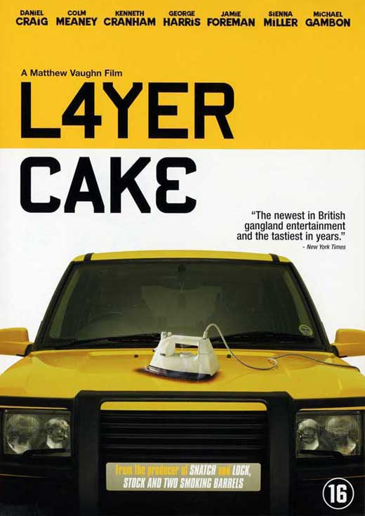
Layer cake
The first thing I notice when looking at this poster is the colour scheme; black and white with a big splash of yellow. The black and white connotes a serious and dark tone for the movie, but the bright primary colour suggests their is also a thrill in the title. The simplicity and lack of detail gives the film a cool and clean theme. The actual props used for the poster are fairly obscure, the iron seems completely irrelevant from what a crime thriller should include, whereas cars are signature features in crime thrillers. The rest of poster is fairly plain and tidy, colours are bold and clean. The title however, is off-center, drawing attention to that part of the film poster. Most features on this posters are ones which I would expect to see: the title, main cast, age rating and a quote are all features I wish to include in my poster. One aspect of this poster that I did not expect, is that it does not say a lot about plot or themes, nor does it include images of the lead characters cast. The image of the car suggests that the film is a driving based film, and the title does not give much info into the plot. This style of marketing can work as the audience are keen to find out more and may look for a trailer or extra information online. However, this could be classed as 'regenrefication' similar to how drive was marketed as a driving film, but was instead more of a slow-paced art thriller/romance.
Snatch
Much like the poster for 'Layer cake'. snatch uses a mostly black and white colour scheme for this poster, with splashes of colour used on important objects. Unlike 'Layer cake', this poster includes the lead characters centered on the poster, yet it does not include the actors names in bold. Each method of displaying characters seem effective in their own way. Similarly though, the title is in black bold text on a lighter colour. From viewing many film posters I can understand that this is a frequent feature in film posters- the title is often bold in a colour that contrasts to the one behind it. By placing the main characters/well-known actors in the foreground the audience is able to familiarize with the actors and from that, gain a better understanding of the films themes and genre. For instance, Jason Statham is well known for his role in crime thrillers, and having Brad Pitt centered in the poster may influence viewers to heighten their expectations for the film. The medium shot featuring the whole of each characters outfits highlights the mis-en-scene of their costumes. The bright colours and oversized smart clothes signify the clumsiness of each character despite their intelligence. Each character is also staring straight into the camera, this exaggerates their intimidating nature. All of this use of mis-en-scene reinforces the genre of crime-thriller due to the exciting look of the characters, but the smart casual clothing of some characters suggests this film is also comedic, which it is.
Hot Fuzz
Featuring two policemen in the foreground of a film poster immediately denotes that the film is one of the buddy-cop genre. This implies the film will include violence and continuous thrills, as well as possibly some comedy. Furthering this, the colours have been edited to be very warm and chrome-like, with an explosion in the background. This gives an effect of a bright, sharp, and fast film immediately establishing it as a crime-thriller. Moreover, the props featured are signature props of a crime-thriller: guns, sunglasses and police uniforms. A heavy use of black and white are used in this poster again, and the title boldly layered over a bright colour is generic of this genre. The mushroom cloud in the background signifies the film is explosive and interesting, moreover the two men walking away from the explosion are therefore signified as dangerous and fearless. As a result of how generic and cliche this poster is, an element of humor is also established due to it's arguable overuse of key conventions. Furthermore, the tag line is another key convention featured in many film posters, especially generic 80's and 90's ones.
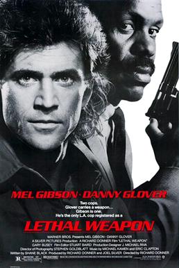
Lethal weapon
Lethal Weapon is an 80's action movie, one that shaped the genre of buddy-cop movies which fit into the crime thriller genre. Similar to the previous posters, the colour scheme is black and white with some colour. However, the title in this poster is a light colour onto a dark one. AS these two colours of red and grey contrast- the same effect is still achieved. Much like 'Hot Fuzz', this poster features the two lead cops who the film is based around. Another convention seen before, is the use of the main actors dominating the frtame, much like Brad Pitt in 'Snatch', Mel Gibson takes up almost half of the poster. Furthering this, a gun is used to establish the crime-thriller tone as it is a signature prop. The gun's featured in most of these films are handguns as they are/were very common for gangsters and cops due to their light weight and ability to be concealed easily. If I am to use a gun in my short film it will be a handgun. One-liners are a common theme in action films such as Lethal Weapon, on this poster the tag line is almost a series of one liners in itself. The repetition of short sentences enables this effect. Much like the other posters each character is staring straight into the camera signifying their intimidating nature.
Now I will visit some short film posters that have each inspired my own plans for a poster in some way:
Real Gone
This is the poster of a short film titled 'Real Gone'. Although not a crime thriller, this poster features conventions of short film posters which I may include in my own. The simplicity of the mis-en-scene corresponds to the simplicity of the short film itself. As short films a re far shorter than feature length films they tend to not carry a deep and complex plot, instead they often aim to produce something simple yet meaningful.The title however is something that does relate to the previous posters, although it does not contrast too much, is it big and bold; dominating the poster. The main contrast in colour features a single man and the ground he is standing on. This reinforces the theme of simplicity included in short films, only one character is often developed heavily. Furthering this, the simplicity of the plot enable the designer to create a poster that establishes the main theme(s) far easier than for a feature film, as they're less complex.
Logan
Logan is a film featuring a young werewolf in an interrogation room. It is primarily a horror film, however I believe the poster and cinematography of the film can be used to inspire my planning and plot- dark colours of black, white, and red are heavily present throughout.
The white-on-black title stands out amongst the background. These are colours which I am likely to use, as I plan on having a darker background due to the dark themes I plan to have for my short film. However, this poster is dissimilar of the majority of crime-thriller posters. Despite this, I think it will still work as my film is planned to be a hybrid genre of both crime and horror thriller- being that I want horror conventions in a film which features visuals and a plot similar to crime-thriller.
The image of the beat-up man on the chair has also given me some ideas for what to incorporate in my short film, as well as reinforced my idea of having the lead character entered on the poster. The colours used also reflect what is featured in the film, almost every shot consists of black, white, red, and beige- the red being the only primary colour as it is used for blood, a common theme of horror titles. The lack of text in this poster highlights the main image and title- the poster is not crowded. The poster therefore establishes the plot and themes behind the film through mise-en-scene.
One other convention I picked up on whilst viewing this poster is the lack of the character's face being in shot. This is a convention also used in the short film 'Real Gone'. I believe this is used primarily in short films as the lead character is often one which is used to drive the plot and express a meaning represented by the director, but the character themselves is not important, they are just a vessel for an idea. This is not apparent in all short films, but I believe it is effectively used in this. Moreover, the placement and shadow of the man give far more detail to the man than his face would.
Control
This poster is for a film titled 'Control' directed by Anton Corbijn. The pink text on a black background is similar that of Drive, and the black and white image is similar to the poster for Scarface. From these two possible influence alone connotations are already being made. Another possible reference of the cigarette in the mouth refers to The Good, The Bad, And The Ugly, although this is an image featured in many films.
I greatly appreciate the artwork of this poster and feel I may use the roughly the same colour scheme. Furthermore, the image of a protagonist centred in frame is also a convention I plan on using. Black and white has connotations of good and evil, the use of them being split 50/50 further connotes a link between the colours i.e. good vs evil- a common theme in thrillers.
The Landing


No comments:
Post a Comment