
I am considering using a similar font for my poster title, although I will not use this text for the rest of the text on the poster. I may also use a font like this for the opening title, but again, the credits would be presented in a different font.
Although my film would not often be considered 'film noire', films from that movement have broadened my understanding of film-making significantly, most notably the act of conveying meaning through clever mis-en-scene. Therefore I have considered using a font similar to those used in film noire title sequencing for the opening title.
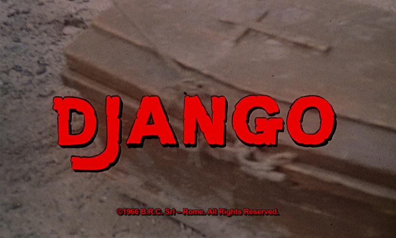
Django (1966) is a Spaghetti Western directed by Sergio Corbucci. The font used in the title sequence is similar to that used by Tarantino in Pulp Fiction, and identical to the font used in D'jango Unchained. Similarly, it uses a bold colour for the foreground with a darker copy of the text layered behind it to give the text a 3D effect.
I plan on experimenting with this technique for my poster and title sequence for my third draft.
No comments:
Post a Comment